I found this data set from the FiveThirtyEight website about American opinions on the Coronavirus in relation to political events from March 2020 to April 2021: https://data.fivethirtyeight.com/ I chose to use the covid_concern_polls.csv file to recreate the graph about how worried Americans are about Covid infection, which can be found here. I added the original graph in this section for convenience. I examined the data to discover there are start and end dates for each response and four levels of worry for each topic: very, somewhat, not very, and not at all, which are all represented on the graph I want to replicate. There are 678 observations of 15 variables stored in this dataset.
spc_tbl_ [678 × 15] (S3: spec_tbl_df/tbl_df/tbl/data.frame)
 $ start_date : Date[1:678], format: "2020-01-27" "2020-01-31" ...
 $ end_date   : Date[1:678], format: "2020-01-29" "2020-02-02" ...
 $ pollster   : chr [1:678] "Morning Consult" "Morning Consult" "YouGov" "Morning Consult" ...
 $ sponsor    : chr [1:678] NA NA "Economist" NA ...
 $ sample_size: num [1:678] 2202 2202 1500 2200 1000 ...
 $ population : chr [1:678] "a" "a" "a" "a" ...
 $ party      : chr [1:678] "all" "all" "all" "all" ...
 $ subject    : chr [1:678] "concern-economy" "concern-economy" "concern-infected" "concern-economy" ...
 $ tracking   : logi [1:678] FALSE FALSE FALSE FALSE FALSE FALSE ...
 $ text       : chr [1:678] "How concerned are you that the coronavirus will impact the following? U.S. economy" "How concerned are you that the coronavirus will impact the following? U.S. economy" "Taking into consideration both your risk of contracting it and the seriousness of the illness, how worried are "| __truncated__ "How concerned are you that the coronavirus will impact the following? U.S. economy" ...
 $ very       : num [1:678] 19 26 13 23 11 11 22 22 22 10 ...
 $ somewhat   : num [1:678] 33 32 26 32 24 28 23 35 21 28 ...
 $ not_very   : num [1:678] 23 25 43 24 33 39 37 28 33 42 ...
 $ not_at_all : num [1:678] 11 7 18 9 20 22 19 15 23 19 ...
 $ url        : chr [1:678] "https://morningconsult.com/wp-content/uploads/2020/02/200167_crosstabs_CORONAVIRUS_Adults_v2_JB-1.pdf" "https://morningconsult.com/wp-content/uploads/2020/02/200191_crosstabs_CORONAVIRUS_Adults_v2_JB-1.pdf" "https://d25d2506sfb94s.cloudfront.net/cumulus_uploads/document/73jqd6u5mv/econTabReport.pdf" "https://morningconsult.com/wp-content/uploads/2020/02/200214_crosstabs_CORONAVIRUS_Adults_v4_JB.pdf" ...
 - attr(*, "spec")=
  .. cols(
  ..   start_date = col_date(format = ""),
  ..   end_date = col_date(format = ""),
  ..   pollster = col_character(),
  ..   sponsor = col_character(),
  ..   sample_size = col_double(),
  ..   population = col_character(),
  ..   party = col_character(),
  ..   subject = col_character(),
  ..   tracking = col_logical(),
  ..   text = col_character(),
  ..   very = col_double(),
  ..   somewhat = col_double(),
  ..   not_very = col_double(),
  ..   not_at_all = col_double(),
  ..   url = col_character()
  .. )
 - attr(*, "problems")=<externalptr>
dim(pollsdata)
[1] 678 15
Ask AI to recreate the original graph
This is the original prompt that I asked ChatGPT 3.5: R code to generate the graph titled “How worried are Americans about infection?” on this website https://projects.fivethirtyeight.com/coronavirus-polls/ using the covid_concern_polls.csv file from this github repository https://github.com/fivethirtyeight/covid-19-polls
I used the links to the website and GitHub repository to ensure that it knew which graph I am trying to recreate, which has been saved as Inspiration_graph.png in the presentation-exercise folder. The first step it gave me was to load three packages: readr, dplyr, and ggplot2. The second step was to save the data as an object, which I have already done. Next, it suggested filtering the data for the question regarding infection: “How worried are you about personally being infected with coronavirus?”. I made several modifications to the code because it did not know the object name that I stored my data in, and it did not know the exact verbiage of the question that was asked. This was not successful because I do not have one “estimate” for the percentage of people in each of the worry categories ranging from not_at_all to very. I should have known that this code would not be accurate because it said these steps will produce a polar bar graph when I am trying to produce a line graph. I commented out this code for the sake of rendering my website with this exercise.
# load required packageslibrary(dplyr)library(ggplot2)# modified filtering code# concern_data <- pollsdata %>%# filter(text == "How worried are you about you or someone in your family being infected with the Coronavirus??") %>%# select(starts_with("estimate"))
This is the second prompt I asked ChatGPT: R code to produce a line graph with percentages of four different categories “very”, “somewhat”, “not very”, and “not at all” on the y-axis and time on the x-axis using the covid_concern_polls.csv file from this github repository https://github.com/fivethirtyeight/covid-19-polls
I asked for a line graph specifically, and I know that I need to create variables with the percentages of each response category. I filtered for the subject of interest: “concern-infected” to limit the data to information about concern over Coronavrius infection. The graph models how concerned Americans are that they, someone in their family or someone else they know will be infected with Coronavirus, so I filtered for responses to all of the questions asking about concern over Coronavirus infections, which yielded 77 observations.
# filter for all responses about Coronavirus concernconcern_data <- pollsdata %>%filter(subject =="concern-infected")
The next suggestion from ChatGPT was to create percentages for each of the response variables. The first variable that had to be changed here is the grouping factor because modeldate was not included in the original dataset. Additionally, there were no “estimate” variables, so I just used the column names instead because each column had count data for that observation.
# group data by date and calculate percentages for each categoryconcern_data2 <- concern_data %>%group_by(end_date) %>%summarise(very_percent =sum(very) /n(),somewhat_percent =sum(somewhat) /n(),not_very_percent =sum(not_very) /n(),not_at_all_percent =sum(not_at_all) /n() )# check that it worked str(concern_data2)
ChatGPT suggested changing the shape of the data before attempting to visualize it. It did not account for the fact that I need the tidyr package to use the pivot_longer() function, so I loaded that package here. This transformation left me with a data set with 276 observations of 3 variables.
# load packageslibrary(tidyr)# convert shape of the datasetconcern_data_long <- concern_data2 %>%pivot_longer(cols =c(very_percent, somewhat_percent, not_very_percent, not_at_all_percent),names_to ="Concern Level",values_to ="Percentage")
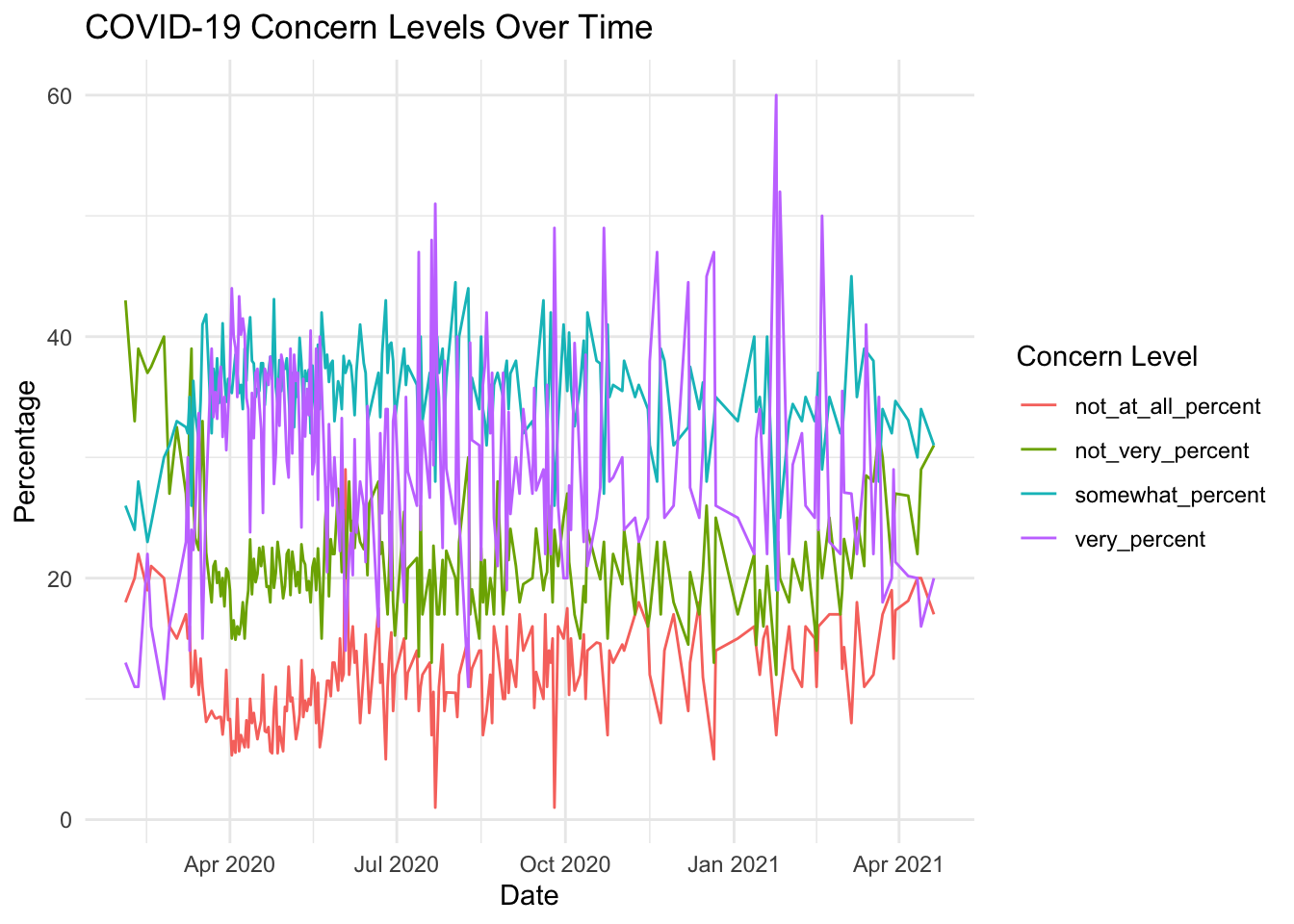
Lastly, I attempted to recreate the plot from the original webpage. The first attempt is not bad, but it looks like I have missing data in the “not_at_all_percent” variable which was not the case in the graph on the website.
# attempt to recreate the original plotgraph1 <-ggplot(concern_data_long, aes(x = end_date, y = Percentage, color =`Concern Level`)) +geom_line() +labs(title ="COVID-19 Concern Levels Over Time",x ="Date",y ="Percentage",color ="Concern Level") +theme_minimal()graph1
After finding there are 6 missing observations of the Percentage variable, I decided to omit those values because they account for such a minimal percentage of total observations, which fixed the strange gap in the line graph.
# explore for missing data and remove itsum(is.na(concern_data_long$Percentage))
[1] 8
concern_data_long <-na.omit(concern_data_long)# check that missing data removal fixed the issuegraph2 <-ggplot(concern_data_long, aes(x = end_date, y = Percentage, color =`Concern Level`)) +geom_line() +labs(title ="COVID-19 Concern Levels Over Time",x ="Date",y ="Percentage",color ="Concern Level") +theme_minimal()graph2
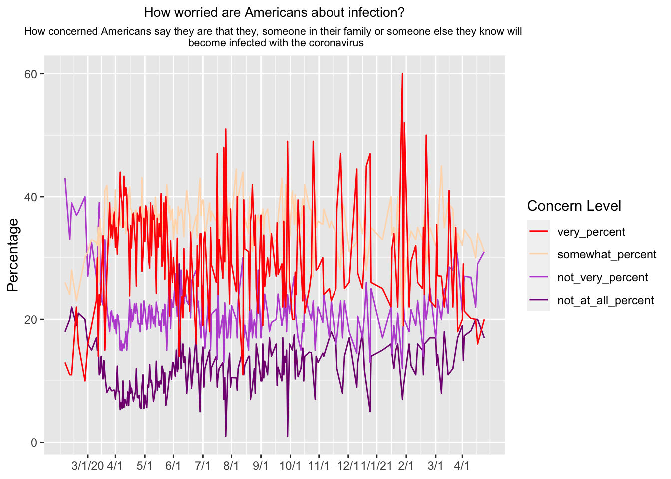
I need to make aesthetic changes, so the replicated graph matches the original graph more accurately. The title needs to be changed and centered. I used ChatGPT to create code to separate the title into three lines and change the size of the second title line, so it will fit better. I got a warning message that vectorized input to element_text is not supported in ggplot2, so all three lines of the title are the same size. The original x-axis labels each month, so I created custom labels and dropped the “date” label for the entire axis. While the original graph is interactive, that is slightly out of reach with my coding knowledge right now, so I decided to keep the stagnant legend. I noticed the legend was inverted, so I corrected that. I manually changed the colors of the lines using hex codes.
# create 14 breaks for the x-axis and custom labels for each breakbreaks <-seq(as.Date("2020-02-28"), by ="month", length.out =14)custom_labels <-c("3/1/20", "4/1", "5/1", "6/1", "7/1","8/1", "9/1", "10/1", "11/1", "12/1", "1/1/21", "2/1", "3/1", "4/1")# create updated version of the graph with modificationsgraph3 <-ggplot(concern_data_long, aes(x = end_date, y = Percentage, color =`Concern Level`)) +geom_line() +scale_color_manual(values =c("#800080","#BA55D3","#FFDAB9","#FF0000")) +labs(title ="How worried are Americans about infection?",subtitle =paste("How concerned Americans say they are that they, someone in their family or someone else they know will", "\n", "become infected with the coronavirus")) +theme(plot.title =element_text(hjust =0.5, size =10), plot.subtitle =element_text(hjust =0.5, size =8)) +scale_x_date(breaks = breaks, labels = custom_labels) +xlab(NULL) +guides(color =guide_legend(reverse =TRUE))graph3
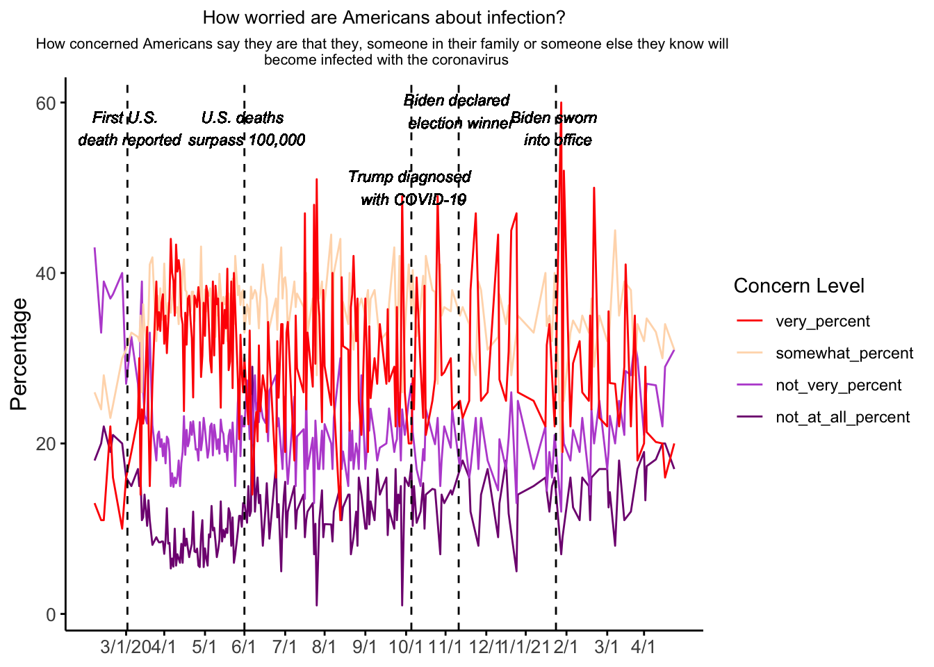
Lastly, I need to add labels on specific dates. I used this simple prompt in ChatGPT: how to add labels to specific dates on a line graph. It suggested adding a geom_text() layer. I had to go back and forth with ChatGPT a couple times to find a date format that worked. Unfortunately, I received a consistent error about the geom_text() layer not being able to find the Percentage variable which prevented it from adding the labels onto my existing graph. I attempted the same format with geom_label() and got the same error. I added an arbitrary Percentage variable to the labels_data just to see if that would fix the error, but it was also unsuccessful. I would appreciate any input on how to solve this error. I commented out the last piece of code for the sake of rendering my website.
# create custom labels to be added as another layer on the original graph labels_data <-data.frame(modeldate =as.Date(c("2020-02-29", "2020-05-28", "2020-10-02", "2020-11-07", "2021-01-02")), label_text =c("First US death reported", "US deaths surpass 100,000", "Trump diagnosed with Covid-19", "Biden declared election winner", "Biden sworn into office",Percentage =c(60, 60, 60, 60, 60)))## graph4 <- graph3 + ## geom_label(data = labels_data, aes(x = modeldate, y=Percentage, label = label_text))
After receiving input from a classmate, Erick Mollinedo, I added several geom_vline() and geom_text() functions to add the missing labels. The geom_vline() functions created dashed lines on each of the important dates, which I think solved the previous issue because it provided a location for the new layer to be added to in ggplot(). The geom_text() functions allow the actual descriptions to be added. The labels were a little too large for my graph originally, so I changed the size of each one to make them fit better. This addition brought me much closer to replicating the original graph although my lines appear to be significantly more jagged than the original. I also received a suggestion to use the ggthemes package to make the final replication appear closer to the original by adding the theme_538() function. I received multiple errors about not being able to find this function, so ChatGPT suggested creating my own function to mimic the 538 theme. This change removed the gridlines in the background and adjusted the sizing of the x-axis labels to match the original graph more closely.
# create a function to mimic the 538 styletheme_538 <-function() {theme_minimal() +theme(axis.title =element_text(size =12),axis.text =element_text(size =10),panel.grid.major =element_blank(),panel.grid.minor =element_blank(),panel.border =element_blank(),panel.background =element_blank(),axis.line =element_line(color ="black"),axis.ticks =element_line(color ="black"),plot.title =element_text(size =14, hjust =0.5) )}# apply the 538 style function and add labels to dates of interestgraph4 <-ggplot(concern_data_long, aes(x = end_date, y = Percentage, color =`Concern Level`)) +geom_line() +theme_538() +scale_color_manual(values =c("#800080","#BA55D3","#FFDAB9","#FF0000")) +labs(title ="How worried are Americans about infection?",subtitle =paste("How concerned Americans say they are that they, someone in their family or someone else they know will", "\n", "become infected with the coronavirus")) +theme(plot.title =element_text(hjust =0.5, size =10), plot.subtitle =element_text(hjust =0.5, size =8)) +scale_x_date(breaks = breaks, labels = custom_labels) +xlab(NULL) +guides(color =guide_legend(reverse =TRUE)) +geom_vline(xintercept =as.Date("2020-02-29"), linetype ="dashed") +geom_vline(xintercept =as.Date("2020-05-28"), linetype ="dashed") +geom_vline(xintercept =as.Date("2020-10-02"), linetype ="dashed") +geom_vline(xintercept =as.Date("2020-11-07"), linetype ="dashed") +geom_vline(xintercept =as.Date("2021-01-20"), linetype ="dashed") +geom_text(aes(x =as.Date("2020-02-29"), y =55, label =paste("First U.S.", "\n", "death reported")), size =3, angle =0, vjust =0, fontface ="italic", color ="black") +geom_text(aes(x =as.Date("2020-05-28"), y =55, label =paste("U.S. deaths", "\n", "surpass 100,000")), size =3, angle =0, vjust =0, fontface ="italic", color ="black") +geom_text(aes(x =as.Date("2020-10-02"), y =48, label =paste("Trump diagnosed", "\n", "with COVID-19")), size =3, angle =0, vjust =0, fontface ="italic", color ="black") +geom_text(aes(x =as.Date("2020-11-07"), y =57, label =paste("Biden declared", "\n", "election winner")), size =3, angle =0, vjust =0, fontface ="italic", color ="black") +geom_text(aes(x =as.Date("2021-01-20"), y =55, label =paste("Biden sworn", "\n", "into office")), size =3, angle =0, vjust =0, fontface ="italic", color ="black")graph4
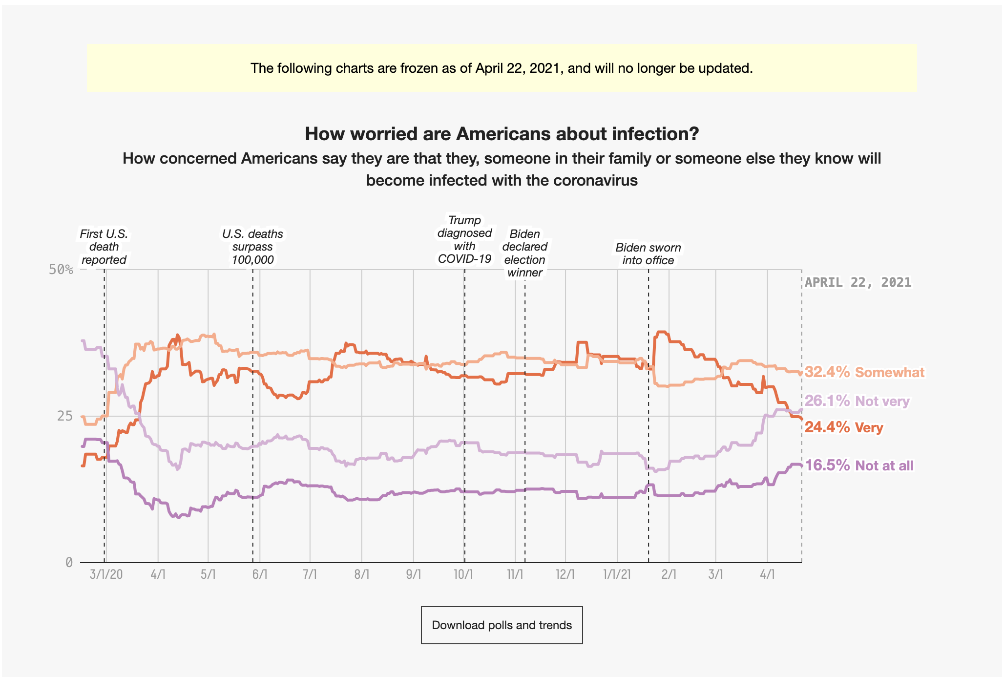
Original graph included again for quick comparison.
Since Dr. Handel recommended that new users begin with the gt package when creating tables, I specifically asked ChatGPT to use that package with this prompt: R code using the gt package to create a table displaying the percentages for four categories (very, somewhat, not very, not at all) for each daily observation. I am using the same data from the exercise above, which is stored as concern_data2.
The original code provided by ChatGPT had outdated syntax in the column argument of the tab_spanner() function, so I updated that using the simple c() function. I also had to add the real variable names found in concern_data2.
# load packageslibrary(gt)# generate first attempt at publication quality tabletable1 <- concern_data2 %>%gt() %>%tab_spanner(label ="Percentage",columns =c(very_percent, somewhat_percent, not_very_percent, not_at_all_percent) ) %>%tab_header(title ="Observations with Percentage Breakdown" )table1
Observations with Percentage Breakdown
end_date
Percentage
very_percent
somewhat_percent
not_very_percent
not_at_all_percent
2020-02-04
13.00000
26.00000
43.00000
18.000000
2020-02-09
11.00000
24.00000
33.00000
20.000000
2020-02-11
11.00000
28.00000
39.00000
22.000000
2020-02-16
22.00000
23.00000
37.00000
19.000000
2020-02-18
16.00000
24.50000
37.50000
21.000000
2020-02-25
10.00000
30.00000
40.00000
20.000000
2020-02-28
16.00000
31.00000
27.00000
16.000000
2020-03-03
19.00000
33.00000
32.50000
15.000000
2020-03-08
23.00000
32.50000
27.00000
17.000000
2020-03-09
30.00000
32.00000
24.00000
15.000000
2020-03-10
14.00000
35.00000
35.00000
16.000000
2020-03-11
24.00000
26.00000
39.00000
11.000000
2020-03-12
22.33333
36.33333
26.33333
11.333333
2020-03-13
25.00000
33.66667
23.33333
14.000000
2020-03-15
33.66667
31.33333
22.33333
10.333333
2020-03-16
23.00000
34.66667
28.66667
13.333333
2020-03-17
15.00000
41.00000
33.00000
11.000000
2020-03-19
26.93333
41.83333
22.13333
8.100000
2020-03-22
39.00000
32.00000
18.00000
9.000000
2020-03-23
33.33333
37.33333
21.00000
8.666667
2020-03-24
35.40000
35.00000
21.40000
8.400000
2020-03-25
33.20000
38.20000
19.60000
8.400000
2020-03-26
36.50000
34.50000
20.50000
8.500000
2020-03-27
37.50000
35.50000
18.50000
8.500000
2020-03-28
31.70000
41.10000
20.00000
7.050000
2020-03-29
35.00000
36.66667
17.66667
8.666667
2020-03-30
30.60000
34.60000
20.80000
12.400000
2020-03-31
34.00000
36.50000
20.50000
8.250000
2020-04-01
37.00000
35.66667
19.00000
8.333333
2020-04-02
44.00000
35.33333
15.00000
5.333333
2020-04-03
40.00000
37.00000
16.50000
6.500000
2020-04-04
39.10000
38.50000
14.90000
5.550000
2020-04-05
35.00000
37.00000
16.00000
10.000000
2020-04-06
43.33333
35.33333
15.33333
5.666667
2020-04-07
40.16667
36.00000
16.16667
7.000000
2020-04-08
41.50000
34.00000
18.00000
6.500000
2020-04-09
40.25000
39.00000
15.00000
6.000000
2020-04-10
34.92500
36.35000
17.67500
8.225000
2020-04-11
34.00000
40.00000
19.00000
6.000000
2020-04-12
23.80000
41.60000
23.20000
10.000000
2020-04-13
35.33333
38.00000
18.66667
8.000000
2020-04-14
31.59286
37.78143
21.59286
8.831429
2020-04-15
37.00000
35.00000
19.66667
7.666667
2020-04-16
37.33333
35.66667
20.33333
6.666667
2020-04-17
34.50000
35.50000
22.50000
7.500000
2020-04-18
32.40000
37.80000
21.00000
8.200000
2020-04-19
25.40000
37.80000
22.60000
12.000000
2020-04-20
37.33333
34.33333
21.00000
7.333333
2020-04-21
36.78667
36.70833
19.27500
7.236667
2020-04-22
36.00000
37.00000
19.33333
7.666667
2020-04-23
38.33333
38.33333
18.00000
5.666667
2020-04-24
36.50000
36.50000
22.50000
5.500000
2020-04-25
27.80000
43.10000
19.20000
9.200000
2020-04-26
30.28571
35.85714
20.42857
11.000000
2020-04-27
36.50000
34.50000
23.00000
5.500000
2020-04-28
32.62200
38.05200
21.70200
7.692000
2020-04-29
38.50000
35.50000
20.00000
6.500000
2020-04-30
37.66667
37.33333
18.33333
5.666667
2020-05-01
33.66667
37.33333
19.33333
9.333333
2020-05-02
29.70000
38.20000
22.00000
9.000000
2020-05-03
28.33333
35.33333
22.33333
12.666667
2020-05-04
39.00000
32.20000
18.60000
9.800000
2020-05-05
30.32833
36.97500
22.19167
10.105000
2020-05-06
38.50000
32.50000
21.00000
8.500000
2020-05-07
36.33333
37.00000
19.33333
6.666667
2020-05-08
37.00000
35.00000
20.50000
7.500000
2020-05-09
31.60000
39.90000
18.80000
8.700000
2020-05-10
24.20000
37.80000
22.80000
13.200000
2020-05-11
36.50000
34.00000
21.50000
8.500000
2020-05-12
31.73400
37.18200
21.12800
9.850000
2020-05-13
35.66667
36.33333
19.00000
9.000000
2020-05-14
33.50000
37.25000
19.75000
10.000000
2020-05-15
40.50000
32.00000
18.00000
9.500000
2020-05-16
28.60000
37.60000
20.90000
12.400000
2020-05-17
29.60000
34.60000
21.60000
11.800000
2020-05-18
39.00000
33.25000
19.00000
8.000000
2020-05-19
26.49333
39.33000
22.45667
11.320000
2020-05-20
40.00000
34.00000
19.50000
6.000000
2020-05-21
36.00000
42.00000
15.00000
7.000000
2020-05-23
27.60000
37.40000
24.80000
9.700000
2020-05-24
20.50000
38.50000
27.50000
11.500000
2020-05-25
32.75000
36.25000
18.50000
11.500000
2020-05-26
28.44000
37.74667
23.22333
10.226667
2020-05-27
26.00000
38.00000
22.00000
13.000000
2020-05-28
30.00000
33.00000
22.00000
13.000000
2020-05-30
24.60000
36.30000
27.40000
10.700000
2020-05-31
22.25000
35.75000
24.25000
15.000000
2020-06-01
33.25000
34.00000
20.50000
11.500000
2020-06-02
22.60000
38.40000
25.63333
12.066667
2020-06-03
14.00000
37.00000
20.00000
29.000000
2020-06-05
22.00000
38.00000
28.00000
12.000000
2020-06-06
23.70000
37.60000
23.90000
14.300000
2020-06-07
20.25000
36.00000
24.75000
16.000000
2020-06-08
31.50000
33.50000
22.50000
13.000000
2020-06-09
23.77667
37.13667
24.82333
13.963333
2020-06-11
28.00000
41.00000
23.00000
8.000000
2020-06-13
26.00000
37.80000
22.40000
12.300000
2020-06-14
21.33333
37.00000
24.00000
15.333333
2020-06-15
34.25000
33.00000
20.25000
12.250000
2020-06-16
30.30000
33.60000
26.20000
8.833333
2020-06-21
16.00000
37.00000
28.00000
17.500000
2020-06-22
32.00000
33.33333
22.00000
11.333333
2020-06-23
25.37500
38.59000
22.97000
12.875000
2020-06-25
34.00000
43.00000
19.00000
5.000000
2020-06-26
34.00000
37.00000
17.00000
11.000000
2020-06-27
23.10000
39.30000
21.80000
13.800000
2020-06-28
19.00000
39.50000
25.50000
15.500000
2020-06-29
33.00000
38.00000
18.00000
9.000000
2020-06-30
34.25000
33.25000
15.25000
12.000000
2020-07-05
18.00000
39.00000
25.50000
15.000000
2020-07-06
35.00000
36.00000
15.00000
10.000000
2020-07-07
28.83500
37.58000
20.81000
12.160000
2020-07-12
26.00000
36.00000
21.66667
14.000000
2020-07-13
47.00000
30.50000
13.50000
9.000000
2020-07-14
24.00000
40.00000
26.00000
11.000000
2020-07-15
33.00000
33.00000
17.00000
12.000000
2020-07-19
26.66667
37.00000
20.66667
13.000000
2020-07-20
48.00000
31.50000
13.00000
7.000000
2020-07-21
29.35500
36.37000
22.68000
10.575000
2020-07-22
51.00000
28.00000
20.00000
1.000000
2020-07-23
37.00000
40.00000
17.00000
6.000000
2020-07-24
35.00000
37.00000
17.00000
11.000000
2020-07-26
22.50000
39.00000
21.50000
14.500000
2020-07-27
38.00000
33.00000
17.00000
9.000000
2020-07-28
29.07333
36.47000
22.26333
10.536667
2020-08-02
24.50000
44.50000
20.00000
10.500000
2020-08-03
40.00000
32.50000
17.00000
8.500000
2020-08-04
25.00000
40.00000
23.00000
12.000000
2020-08-09
11.00000
44.00000
30.00000
15.000000
2020-08-10
39.50000
31.50000
17.00000
11.000000
2020-08-11
31.43000
36.58500
19.06000
12.510000
2020-08-15
31.00000
34.00000
15.00000
14.000000
2020-08-16
21.50000
40.00000
22.50000
14.000000
2020-08-17
36.00000
34.00000
18.00000
7.000000
2020-08-18
37.50000
33.00000
21.50000
8.000000
2020-08-19
42.00000
31.00000
17.00000
9.000000
2020-08-21
32.00000
36.00000
20.00000
12.000000
2020-08-22
37.00000
33.00000
19.00000
8.000000
2020-08-23
25.00000
36.00000
17.00000
16.000000
2020-08-25
21.00000
37.00000
28.00000
14.000000
2020-08-28
37.00000
35.00000
17.00000
10.000000
2020-08-29
31.00000
37.00000
19.00000
10.000000
2020-08-30
19.00000
38.00000
25.50000
16.000000
2020-08-31
33.75000
34.00000
21.50000
10.500000
2020-09-01
25.31500
36.95000
24.08000
13.205000
2020-09-04
30.00000
38.00000
21.00000
11.000000
2020-09-06
27.00000
35.00000
18.00000
17.000000
2020-09-08
34.00000
32.00000
19.50000
14.000000
2020-09-13
27.00000
33.00000
20.00000
16.000000
2020-09-14
35.75000
32.00000
21.75000
9.250000
2020-09-15
27.27500
36.37000
24.10500
12.225000
2020-09-19
29.00000
43.00000
19.00000
10.000000
2020-09-20
22.00000
36.00000
20.00000
17.000000
2020-09-21
36.00000
32.50000
20.50000
11.000000
2020-09-22
24.00000
36.00000
26.00000
14.000000
2020-09-23
22.00000
42.00000
22.00000
13.000000
2020-09-24
29.00000
33.00000
18.00000
15.000000
2020-09-25
49.00000
26.00000
24.00000
1.000000
2020-09-27
26.00000
33.00000
21.00000
16.000000
2020-09-30
20.00000
41.00000
25.00000
15.000000
2020-10-02
20.00000
35.50000
27.00000
17.500000
2020-10-03
27.66667
40.33333
21.33333
10.333333
2020-10-04
24.00000
36.00000
20.00000
15.000000
2020-10-06
39.47000
32.58000
16.97000
10.690000
2020-10-09
29.00000
36.00000
15.00000
12.000000
2020-10-11
23.00000
39.66667
19.33333
15.333333
2020-10-12
38.50000
31.50000
18.00000
10.000000
2020-10-13
21.00000
42.00000
24.00000
14.000000
2020-10-18
25.00000
38.00000
21.00000
14.666667
2020-10-20
27.48333
37.77333
19.91000
14.576667
2020-10-22
49.00000
27.00000
23.00000
NA
2020-10-24
36.00000
41.00000
15.00000
7.000000
2020-10-25
28.00000
35.00000
18.00000
14.000000
2020-10-27
28.33333
36.00000
22.00000
13.000000
2020-11-01
30.00000
35.50000
19.50000
14.500000
2020-11-02
24.00000
38.00000
24.00000
14.000000
2020-11-08
25.00000
35.00000
17.00000
17.000000
2020-11-10
23.00000
36.00000
23.00000
18.000000
2020-11-15
25.00000
34.00000
16.00000
16.000000
2020-11-16
38.00000
31.00000
17.00000
12.000000
2020-11-20
47.00000
28.00000
23.00000
NA
2020-11-22
36.00000
39.00000
17.00000
8.000000
2020-11-24
25.00000
38.00000
23.00000
14.000000
2020-11-29
26.00000
31.00000
18.00000
17.000000
2020-12-07
44.50000
32.50000
14.50000
9.000000
2020-12-08
27.50000
37.50000
20.50000
13.000000
2020-12-13
25.00000
34.00000
17.00000
18.000000
2020-12-15
30.75500
36.20000
20.60500
11.770000
2020-12-17
45.00000
28.00000
26.00000
NA
2020-12-21
47.00000
33.00000
13.00000
5.000000
2020-12-22
26.00000
35.00000
25.00000
14.000000
2021-01-03
25.00000
33.00000
17.00000
15.000000
2021-01-12
22.00000
40.00000
22.00000
16.000000
2021-01-13
31.54500
33.77500
14.46000
14.390000
2021-01-15
34.00000
35.00000
19.00000
12.000000
2021-01-17
28.00000
32.00000
16.00000
15.000000
2021-01-19
22.00000
40.00000
21.00000
16.000000
2021-01-24
60.00000
19.00000
12.00000
7.000000
2021-01-25
19.00000
41.00000
23.00000
9.000000
2021-01-26
52.00000
25.00000
20.00000
NA
2021-01-31
22.00000
33.00000
18.00000
16.000000
2021-02-02
29.40500
34.42000
21.57500
12.500000
2021-02-07
32.00000
33.00000
19.00000
11.000000
2021-02-09
26.00000
35.00000
23.00000
16.000000
2021-02-14
25.00000
33.00000
16.00000
15.000000
2021-02-15
35.00000
34.00000
14.00000
11.000000
2021-02-16
24.00000
37.00000
24.00000
16.000000
2021-02-18
50.00000
29.00000
20.00000
NA
2021-02-22
23.00000
35.00000
25.00000
17.000000
2021-02-28
22.00000
32.00000
17.00000
17.000000
2021-03-01
35.50000
32.00000
19.00000
12.500000
2021-03-02
27.08500
34.20000
23.23500
14.280000
2021-03-06
27.00000
45.00000
20.00000
8.000000
2021-03-09
22.00000
35.00000
25.00000
18.000000
2021-03-13
29.00000
39.00000
21.00000
11.000000
2021-03-14
41.00000
NA
28.50000
NA
2021-03-18
22.00000
38.00000
28.00000
12.000000
2021-03-21
35.00000
28.00000
32.00000
NA
2021-03-23
18.00000
34.00000
30.00000
17.000000
2021-03-28
20.00000
32.00000
21.00000
19.000000
2021-03-29
29.00000
33.33333
24.66667
13.333333
2021-03-30
21.33333
34.66667
27.00000
17.333333
2021-04-06
20.17000
33.08000
26.82500
18.125000
2021-04-11
20.00000
30.00000
22.00000
20.000000
2021-04-13
16.00000
34.00000
29.00000
20.000000
2021-04-20
20.00000
31.00000
31.00000
17.000000
The first table looks decent, but I want to clean up a few things stylistically. I added a more descriptive title and renamed the columns, so the table would not contain variable names. Following my classmate Erick’s suggestion, I created a new variable, month to summarize the data in the original table to make it more useful. I felt like it was unnecessary to have 5 decimal points for each percentage, so I limited the decimals to 1 place when I created the new average percentages by month. The result is a clean and publication-quality table that is much easier to digest than the original.
# load packages required to manipulate dateslibrary(lubridate)# create new month variable to summarize the table and rename columnscovid_summary <- concern_data2 %>%mutate(month =floor_date(as.Date(end_date, format ="%Y-%m-%d"), "month")) %>%group_by(month) %>%#Group by month of the yearsummarise(avg_very_percent =round(mean(very_percent, na.rm =TRUE), 1),avg_somewhat_percent =round(mean(somewhat_percent, na.rm =TRUE), 1),avg_not_very_percent =round(mean(not_very_percent, na.rm =TRUE), 1),avg_not_at_all_percent =round(mean(not_at_all_percent, na.rm =TRUE), 1)) %>%mutate(across(starts_with("avg_"), ~as.numeric(format(., nsmall =2)))) %>%rename(Month ="month", Very ="avg_very_percent",Somewhat ="avg_somewhat_percent",`Not very`="avg_not_very_percent",`Not at all`="avg_not_at_all_percent")## generate table with proper labelstable2 <- covid_summary %>%gt() %>%tab_spanner(label ="Percentage",columns =c("Very", "Somewhat", "Not very", "Not at all")) %>%tab_header(title ="Levels of concern about COVID-19 infections among Americans") %>%fmt_number(columns =c("Very", "Somewhat", "Not very", "Not at all"),decimals =1)table2
Levels of concern about COVID-19 infections among Americans
 I examined the data to discover there are start and end dates for each response and four levels of worry for each topic: very, somewhat, not very, and not at all, which are all represented on the graph I want to replicate. There are 678 observations of 15 variables stored in this dataset.